
|
Trends and news in South Korea's book design
2018.01
Despite there being very limited space on a book for design, we've seen many changes in book design both experimental and diverse. Up to the early 2000s, it wasn't clear what the concept of book design entailed and at many times people would ask what it was exactly 'book designers' did.
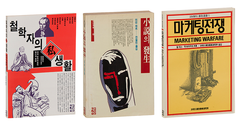
Book designers are one of many people who are involved in making books and not only do they design the covers, they need to understand the font and contemplate how to connect readers with the materialistic characteristics of the book. In the 1980s, the form of books was quite simple and there were limitations as to how books were designed. Looking back, the unique designs from then had influenced book designs to a great extent, when book designers had to work with film by hand in designing the books(See image 1). With the development of programs, it now takes a very small amount of time to get what's inside your head onto the covers of books and there is a much wider selection of fonts and paper. There are more opportunities to find better images and everything, including sharing information on the design process, has become much faster.
Image 1. Book images from the 1980s
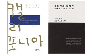
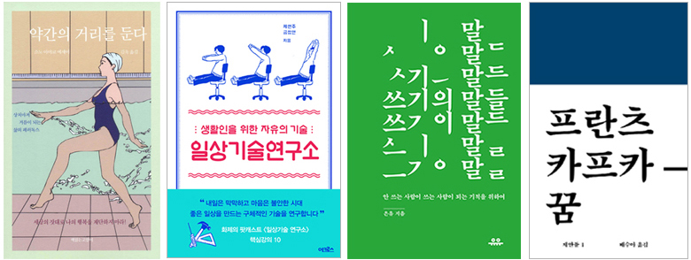
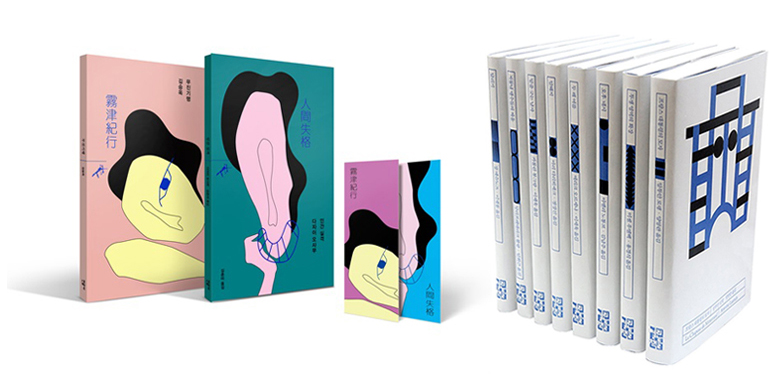
As we went into the mid-to-late 2000s, designs on books started becoming more diverse with more fonts and postprocessing. With the calligraphy boom, unique fonts and handwriting started appearing in advertisements, movie posters and and books. More illustrations started being used and flamboyant yet strong designs also caught the eye of many. In 2010, there was a spike in phrasing brands and globally, "minimalist" designs started picking up in popularity(See image 2). In contrast to the past, covers were no longer being used to convey information and designs started becoming much simpler. Thanks to the influence of Japanese book covers, margins became very important in book design for simple layouts. Serious contemplation over the 'impact' on readers has continued until now. In the case of bus advertisements, one strong slogan itself can become an ad, or a fun image can grab the eye of passersby. On book covers, the main trend has remained simplicity while some experimental elements have been incorporated here and there. For example, a small but fun and strong title might be used along with a unique illustration. Another form of design would be 'tacky' designs, or vintage designs with motifs from the past that only incorporate graphic elements and postprocessing. We are seeing more and more designs that are diverse, as if they are all competing for the most fun and experimental design.(See image 3)
Image 2. California, Design of Design (An Graphics)
Image 3. Setting a bit of space (Book Reading Cat), Research Center For the Skills of the Mundane (Across), Words of Writing (UU Press), Dream (Workroom Press)
As there are now cases where some book designs have led to receiving separate attention from the industry, or directly resulting in higher book sales after having been perceived as 'good design', book designs are no longer a secondary thing in the process of creating books. When contracts are signed for the creation of a book, those involved discuss what design and concept are to be used in the book, what kind of paper will be used, how much weight the book will be given and what unique illustrations will be used on the covers and inside the book. These discussions naturally extend to the marketing of the book. Designs are also key in planning related goods or creating images for the Internet - all things to help the book become known further.
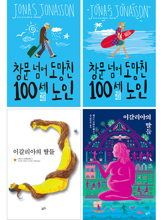
To regular readers, only the designs of bestsellers probably remain in their minds, but those who have a little more interest than the normal reader or people inside the industry actually increasingly buy books to collect publications that have unique designs. As more books fail to be published beyond the first edition, these consumers are opting to buy books to possess them. Noticing this trend, some publishers have decided to publish limited editions of books(See image 4). Books that had stopped being published were at times re-published with snazzier covers while limited editions of steadysellers would be sold revamped and looking more fabulous. That trend has not died yet and continues to draw in readers with small changes here and there.
Image 4. The Centenarian Who Escaped Through the Window (Open Books), Igalia's Daughters (Golden Bough),
In the case of regular books compared to books for collection, they are being manufactured with lighter paper and made smaller to help readers carry them around. Designs are recreated for this purpose and the sizes of the books are changed so they can be gripped with one hand. Rough but light paper is used to print the books on to make them easier to read and they are also simpler in design. Naturally in this process, book prices go down, and readers find themselves searching for lighter and thinner books to read. There are already readers who collect books that offer fewer pages and publishers that plan short story books from South Korean authors which are only expected to spur more variety when it comes to designs.(See image 5)
Elements in book design are now also very important in deciding the identity of the publisher. The overall look of the book, how it's printed, the style of the main content and cover images - all these contribute to the first impression of books. That impact and style books have are increasingly reflecting the characteristics of publishing companies. Similar to how Penguin Books in the United Kingdom has appealed to readers over the years with their brand image, South Korean publishers are slowing moving towards the point where readers can identify some publishers by the covers of their books without checking the logo. The creation of the brand image that previously seemed possible for only bigger publishers is now being done by local independent publishers who publish books with affection, one at a time. Sometimes even the title of the book is nowhere to be found while at times the book is purposely made too big or too small or even like a spiral notebook. The layout of the main content is sometimes stunning, making readers take time to adjust to the new concept.(See image 6)
Image 5. Minumsa's Shooting Arrows series, Open Books' Blue Collection
Image 6. Paper Island (Book Nomad), Proost (Workroom Press)
Nowadays it takes a short amount of time for trends to come and pass. It's fun seeing diverse book forms but it is increasingly becoming difficult to define what good book design is. When giving lectures on book design, one question that is given quite often is, "How much influence do you think design has on readers?" The question is basically asking how much sway design has on readers when it comes to their actual purchasing the books, and I believe that is a question that also addresses the basic fundamentals of book design.
Books will always have their core role as a book. All the elements that make a book have their own purpose, and I believe design will increasingly have a bigger role as time passes. Design is now critical when it comes to lifestyle items like household electronics and book designs are something publishers cannot pass up as they stress the core values of books.
How will book design develop as time passes? Like calligraphy managed to combine itself with design while retaining its callous feel, the current popularity of vintage designs and bold graphic designs may develop into another trend altogether by combining themselves with pure artworks. Designers are now faced with contemplating how many or what images, ratios or colors are used for online marketing but at the same time, there will be more books readers can feel and touch.
Demand for useful and minimal designs is expected to remain. Simultaneously, there will be readers who want fancier finishes to their books with serious weight, resulting in bigger books. The day when all these books grace a single bookshelf is likely to come sooner than later.
Written by Yoony Suk (Head, Mimesis Design Team)
Yoony Suk (Head, Mimesis Design Team) |

Pre Megazine
-

Review of Seoul International Book Fair 2017
VOL.1
2017.06 -
Visiting Book Fair Thailand 2017
VOL.1
2017.06 -
Translated and Published in Taiwan, Meet Chin-Myong Kim's THAAD
VOL.1
2017.06 -
Independent Publishing
VOL.2
2017.07 -
A Korean Publisher Growing With the World
VOL.2
2017.07 -
Gilbut Children
VOL.2
2017.07 -
Character Licensing Fair 2017
VOL.2
2017.07 -
The Online and Digital Marketing of South Korea's Publishing Industry
VOL.3
2017.08 -
Golden Bough
VOL.3
2017.08 -
Black Forest
VOL.3
2017.08 -
2017 Korea Book Fair in Vietnam
VOL.3
2017.08 -
Ji-hyeon Lee's Pool
VOL.3
2017.08 -
Characteristics of South Korean Web Novel Platforms and Ventures Overseas
VOL.4
2017.09 -
Publishing Educational Materials for 40 Years “Darakwon”
VOL.4
2017.09 -
Leading the Popularization of Art “Art Books”
VOL.4
2017.09 -
South Korea to Participate in 2017 International Istanbul Book Fair as Guest of Honor
VOL.4
2017.09 -
Haemin Sunim's The Things You Can See Only When You Slow Down
VOL.4
2017.09 -
The Present and Future of South Korea's "Screensellers"
VOL.5
2017.10 -
Humanist Books
VOL.5
2017.10 -
Dolbegae
VOL.5
2017.10 -
The 2017 Guadalajara International Book Fair
VOL.5
2017.10 -
Interview with You-jeong Jeong
VOL.5
2017.10 -
South Korea's Translated Literature Awards, Where Are They Now?
VOL.6
2017.11 -
UU Press
VOL.6
2017.11 -
Risu·Reading Cat Publishing Company
VOL.6
2017.11 -
Asian Publishers Fellowship Program in Seoul 2017
VOL.6
2017.11 -
Interview with author Soon-won Lee
VOL.6
2017.11 -
10 Keywords: South Korea's publishing industry in 2017 at a glance
VOL.7
2017.12 -
"NexusBOOKS"
VOL.7
2017.12 -
"SangSang Publications"
VOL.7
2017.12 -
2017 Bookstore Day
VOL.7
2017.12 -
Interview with Mi-kyoung Song
VOL.7
2017.12 -
Trends and news in South Korea's book design
VOL.8
2018.01 -
Agencies talk actual copyright export cases
VOL.8
2018.01 -
Daewon CI
VOL.8
2018.01 -
K-Books Blossoming in Central America
VOL.8
2018.01 -
Interview with author Jung-hyuk Kim
VOL.8
2018.01 -
Book Factory Dubulu
VOL.9
2018.05 -
Yaong Seoga
VOL.9
2018.05 -
Where Books and People Become Closer
VOL.9
2018.05 -
Interview with author Kim Tak-hwan
VOL.9
2018.05 -
Book Ecosystem Vision Forum - the 3rd
VOL.10
2018.06 -
The Birth of Publishing Company ‘BookGoodCome’
VOL.10
2018.06 -
Diverse Ways to Love Books
VOL.10
2018.06 -
Ha Seong-Ran, An Author Ready to Talk
VOL.11
2018.07 -
2018 Seoul International Book Fair ‘New Definition’
VOL.11
2018.07 -
GOZKNOCK ENT
VOL.11
2018.07 -
South Korea’s Literary Awards
VOL.11
2018.07
Copyright© 2019 KIPIA. All Rights Reserved.


