
|
Korean Authors
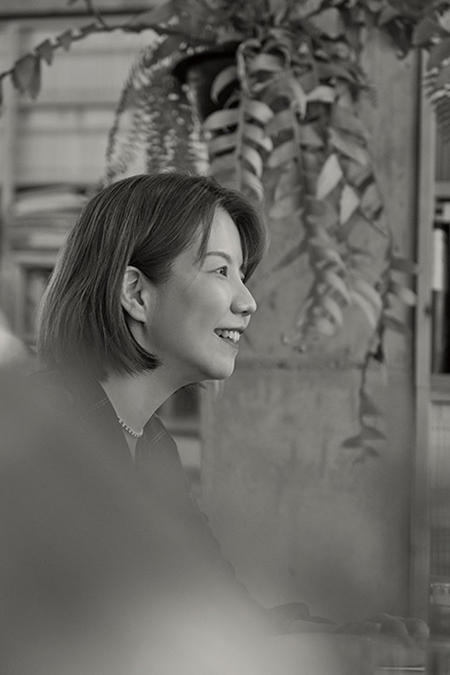
Writer Jiwon Yu A Person Who Brings the World Closer Together Through Stories and Pictures
2022.10.04
In Korea, the 9th of October is “Hangeul Day,” where people commemorate King Sejong’s invention of Hangeul, the Korea writing system. Just as King Sejong wanted Hangeul to spread to the public for good use, there is an individual who wants the world to communicate more closely through design and writing. It is writer Jiwon Yu, who has met her readers as a typographer, designer, and writer through various activities that cross the boundaries of studies. Her communication involves various channels, all based on writings and pictures. Writer Yu tries to find beauty in all areas in the world, such as art, science, mathematics, and humanities, and make it shine brighter. Below is an interview with writer Jiwon Yu, who says that letters and books are the “most reliable and grateful partners” in her life.

It’s a pleasure to have you on K-Book Trends. First, please say hello to our subscribers and introduce yourself.
Hello, I’m Jiwon Yu, a graphic designer, typographer, and writer who loves letters and books. I have been engaging in activities to make typography a charming and friendly work to all people, going across fields of studies. Currently, I’m also running the Institute of Typography and Culture.
You have a special background: from editing to typography and writing, you have worked as a designer, researcher, professor, writer, and translator. Was there a special reason for you to broaden your scope to become a writer after being part of the art world?
I studied design, but I always wrote stories as much as I loved books. I am greatly interested in communication for a better life and society. As design is like “eye communication” and writing is like “language communication,” both fields seem to have a very close relationship with each other.
Design is the “communication of the eyes,” and writing is the “communication of language.”
To find a commonality among the various backgrounds you have, it would be “books” and “letters.” How were they attractive to you?
I have a fondness and a taste in all areas of liberal arts, science, and the arts. I enjoyed writing and drawing, and “letters” were their commonality. I liked logic and visual art, and they had this “typographical system” in common. Letters and books help me make better connections to the world. They are the most trusted and grateful partners I have ever had.
You also worked as a book designer in a publishing house while being a typographer. Comparing the two jobs – a designer who makes the appearance of a book and a writer who writes the story inside, what do you think is their difference when it comes to meeting readers?
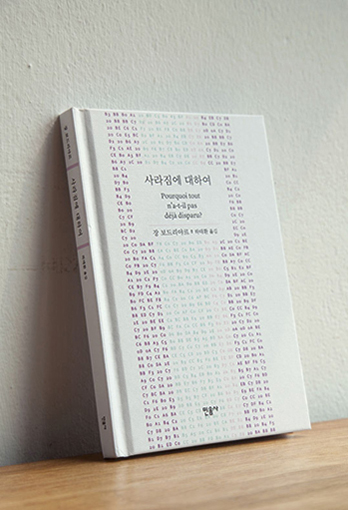
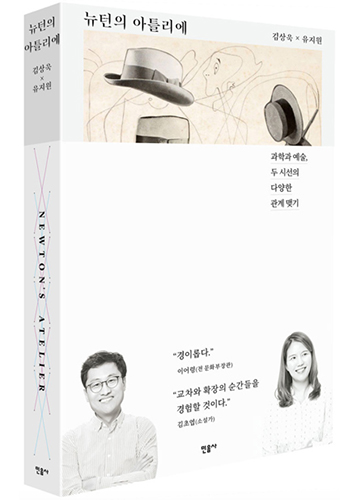
To take Newton’s Atelier (Minumsa) as an example, which I wrote with physics professor Kim Sang-Wook, I designed the book myself. So I was an author and designer at the same time. While an author communicates linguistically through texts, a designer communicates visually and physically through graphics.
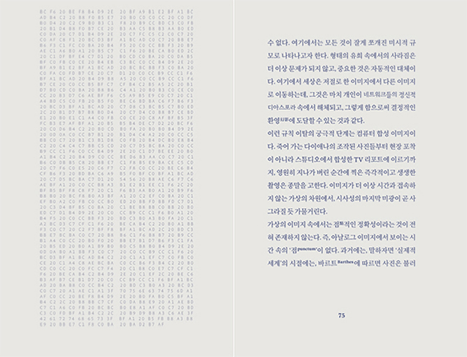
Cover and text designs of Jean Baudrillard’s Why Hasn’t Everything Already Disappeared?
The page on the right is the Korean translation, and the one on the left is the computer-coded hexadecimal of the text. We can see all the letters of the text encoded by the hexachord system on the left page. Between the text and codes we look at, which one is real and which one is false? This design reminds you of the question Jean Baudrillard asks in the book every time you turn the page. As “design communication” transcends the language, I saw foreigners with no knowledge of Korean understanding the subject of the book as soon as they saw the design. But, of course, they were people who had design-literacy.
In your introduction, the sentence “A typographer who discovers beauty and finds inspiration from science conferences and scientific papers” seems impressive. As you wrote Newton’s Atelier with scientist Kim Sang-Wook, you tried to find a connection between science and art. Yet, there seems to be no link between them – what beauty do you find in science?
I think the power of science is linking unexpected things in a logical way, which is awe-inspiring and beautiful. For example, the high “position” and “kinetics” of a moving object are seemingly unrelated to each other, but they are actually linked with the idea of “energy.” It was fun to bring in the eyes of science, which understands invisible actions, and apply them to my ideas. These days, I’m interested in waves. Light, colors, and sounds are a physical phenomena, mathematically explainable, and they are relevant to organisms, human beings, and society given their “perceptible” nature, and are relevant to art as they “express” things.
* K-Book Trends Vol. 42 – Go to the article about writer Kim Sang-Wook
We use “letters” so often in our daily lives, which makes us take them for granted, neglecting their importance or beauty. It must be a frustrating thing for a typographer. But, would it be a way of enjoying letters in a whole new way and finding pleasure in them in our daily lives?
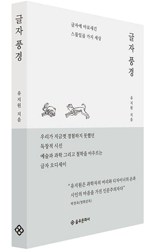
I recommend reading my book Letterscape (Eulyoo Publishing). I’m planning to publish Bookscape (Eulyoo Publishing) and Hangeulscape (Eulyoo Publishing) as follow-ups. Bookscape features the design aspects of books, but it is not about how to design – it is about the “sensitivity” of reading designs. If you have literacy in book design as well as text, you will be able to enjoy books more extensively. By the way, Hangeulscape is literally the in-depth version of Letterscape focusing on Hangeul.
Newton’s Atelier and Letterscape
In your book Letterscape, you talk about how letters are used in many countries such as Germany, Italy, the United States, the United Kingdom, and Spain, as well as in Hangeul in Korea. What is the singularity and beauty of Hangeul among the diverse letters and fonts in the world? Also, what is your favorite Hangeul font?
The Latin alphabet is most commonly used in the world, from European languages such as English, German, and French to Vietnamese and Turkish. They have a lot of advantages, but the relationship between their forms and their pronunciation is not unified. Meanwhile, as Hangeul was invented by King Sejong, the best linguist of the time, devised especially based on logic for the language unique to the Korean people, the letters’ shapes and structures and the spoken language highly match each other. I think this is one of the unique characteristics of Hangeul.
I think we need to create an environment for text technology
In the book Letterscape, you wrote, “Letters evolve according to their environment.” This means that letters change by engaging with the technological environment and other cultures. While society is changing rapidly due to the emergence of new technologies, such as the shift to the digital environment and video media, how do you think the environment surrounding letters should change?
It is also our designer’s job to connect letters implemented in new technologies to people without any feeling of incongruity. I think we should create an environment for text technology with people and life in the center. For example, from now on, letters will float or move and approach people in a three-dimensional space, move away from the flat surface of paper and screen. When these technologies become a part of our daily lives, the way people’s bodies react, sense, and perceive letters and the relationship between them will restructure in an entirely different way. For example, letters may approach your back, sometimes you will miss important parts, experience motion sickness, and see letters of the same size differently depending on the direction the letters approach you. In such a situation, there would be a probability of fabrication, where certain people manipulate the importance of the information. So, I think there needs to be studies that prepare for such a possible future in advance. I really want to take part in it.
We heard that you will be publishing your new title. Please give us a brief introduction to the book with your plans for the future.
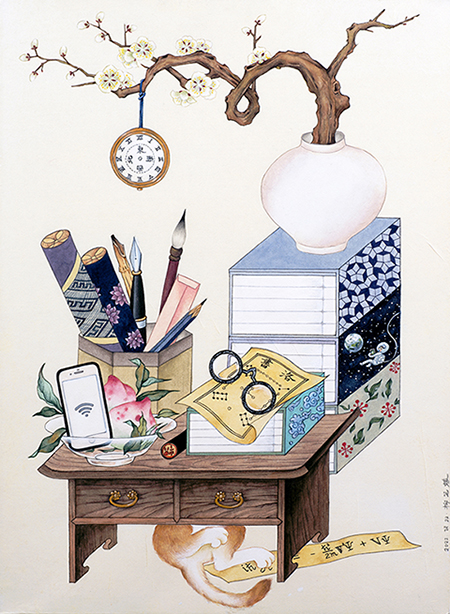
I’m currently preparing the book Words of Letters (UU Press). I wrote it, and I drew the cover illustration myself as well. In the style of “Chaekgeori,” a Korean color painting style of the late Joseon Dynasty, communication tools of all times and objects related to time and space were drawn. “Typography” is the “science and art of arrangement” in which letters form words and phrases and fit together in the text. The book tells the story that “the concept of space and time in which letters are arranged was different” in different Eastern and Western cultural backgrounds, such as mathematics, astronomy, geography, and architecture.
Cover design of Words of Letters
In addition, the book presents typography of various documents that I could access as a Korean researcher. Rather than a grand idea to encompass typography around the world, I hope that it will be a book that fills in one of the missing gaps of Korean typography in the context of typography in the East and West, traditional and modern. This made me more responsible as a researcher, encouraging me to learn Japanese and be interested in Chinese. I’m going to translate some of that into English. I sincerely hope the book reaches typographers worldwide and those who love books and letters.
#Jiwon Yu#Typography#Letters#Designer#Hangeul Day |


Pre Megazine
-

Jakkajungsin Publishing Co.
VOL.69
2024.04 -
Writer Yun Jung-Eun
VOL.69
2024.04 -
Jumping Books Publishing House
VOL.68
2024.03 -
Writer Kim Hwa-Jin
VOL.68
2024.03 -
Publisher Hyohyung
VOL.67
2024.02 -
Writer Minha
VOL.67
2024.02 -
Almond Publishing
VOL.66
2024.01 -
Writer Kwon Jung-Min
VOL.66
2024.01 -
Hakgojae Publishers
VOL.65
2023.12 -
Writer Kim Hye-Jung
VOL.65
2023.12 -
Eidos Publishing House
VOL.64
2023.11 -
Writer Hwang In-Chan
VOL.64
2023.11 -
Munhakdongne
VOL.63
2023.10 -
Writer Chang Kang-myoung
VOL.63
2023.10 -
Happywell Publishing
VOL.62
2023.09 -
Writer Baik Soulinne
VOL.62
2023.09 -
Dasan Contents Group (Dasan Books)
VOL.61
2023.08 -
Writer Lim Kyoung-Sun
VOL.61
2023.08 -
SpringSunshine Publishing Co.
VOL.60
2023.07 -
Writer Lee Kyung-Hye
VOL.60
2023.07 -
Human Cube
VOL.59
2023.06 -
Doctor Jeong Jae-Seung
VOL.59
2023.06 -
Anonbooks
VOL.58
2023.05 -
Writer Son Bo-Mi
VOL.58
2023.05 -
Namhaebomnal
VOL.57
2023.04 -
Writer Kim Bo-Young
VOL.57
2023.04 -
Hugo Publishing
VOL.56
2023.03 -
Writer Cho Kwang-Hee
VOL.56
2023.03 -
Balgeunmirae Publishing Co.
VOL.55
2023.02 -
Writer Lee Byung-Ryul
VOL.55
2023.02 -
Wisdom House, Inc
VOL.54
2023.01 -
Writer Jeong Jia
VOL.54
2023.01 -
Humanitas
VOL.53
2022.12 -
Writer Kim Yeon-Su
VOL.53
2022.12 -
Songsongbooks
VOL.52
2022.11 -
Writer Eun Hee-Kyung
VOL.52
2022.11 -
Bombom Publishing Co.
VOL.51
2022.10 -
Writer Jiwon Yu
VOL.51
2022.10 -
Hangilsa Publishing Co., Ltd.
VOL.50
2022.09 -
Writer Kim Won-Young
VOL.50
2022.09 -
Moksu Publishing Company
VOL.49
2022.08 -
Writer Yoo Sun-Kyong
VOL.49
2022.08 -
Next Wave
VOL.48
2022.07 -
Writer Park Sang-Young
VOL.48
2022.07 -
A Thousand Hopes
VOL.47
2022.06 -
Writer Bora Chung
VOL.47
2022.06 -
Woongjin ThinkBig
VOL.46
2022.05 -
Dr. Oh Eun-Young
VOL.46
2022.05 -
JECHEOLSO Publishing House
VOL.45
2022.04 -
Writer Jang Ryu-Jin
VOL.45
2022.04 -
Changbi Publishers
VOL.44
2022.03 -
Writer Kim Ho-Yeon
VOL.44
2022.03 -
Mati Books
VOL.43
2022.02 -
Writer Lee Kkoch-Nim
VOL.43
2022.02 -
Picturebook Gongjackso
VOL.42
2022.01 -
Writer Kim Sang-Wook
VOL.42
2022.01 -
Writer So-yeon Park
VOL.42
2022.01 -
Writer Yoo Eun sil
VOL.42
2022.01 -
Kungree Press
VOL.41
2021.12 -
Writer Kim Lily
VOL.41
2021.12 -
Writer Park Yeon-jun
VOL.41
2021.12 -
Writer Yi Hyeon
VOL.41
2021.12 -
A deeper world told through picture books 'Iyagikot Publishing (Story Flower)'
VOL.12
2019.06 -
Author Jeon Min-hee
VOL.12
2019.06 -
Illustrator Kim Hwan-Young
VOL.13
2019.07 -
Travelers sailing through the sea of knowledge - 'Across Publishing Group Inc.'
VOL.13
2019.07 -
Genre Novel Publisher 'Arzak Livres'
VOL.14
2019.08 -
Author Lee Yong-han
VOL.14
2019.08 -
Wookwan Sunim
VOL.15
2019.09 -
East-Asia Publishing
VOL.15
2019.09 -
Author Jo Jung-rae
VOL.16
2019.10 -
EunHaeng NaMu Publishing
VOL.16
2019.10 -
Writer Heo Kyo bum
VOL.40
2021.11 -
Writer Kim So-Young
VOL.40
2021.11 -
Author-illustrator Kim Sang Keun
VOL.40
2021.11 -
ACHIMDAL BOOKS
VOL.40
2021.11 -
Author Kang Gyeong-su
VOL.17
2019.11 -
Moonji Publishing Belongs to the Literary Community
VOL.17
2019.11 -
Author Kim Yun-jeong
VOL.18
2019.12 -
I-Seum
VOL.18
2019.12 -
Kim Cho-Yeop
VOL.19
2020.02 -
Creating a window into the future with books
VOL.19
2020.02 -
Author Serang Chung
VOL.20
2020.03 -
Hey Uhm
VOL.20
2020.03 -
Writer Lim Hong-Tek
VOL.21
2020.04 -
BIR
VOL.21
2020.04 -
Writer Song Mikyoung
VOL.39
2021.10 -
Author-illustrator Kim Dong Su
VOL.39
2021.10 -
Writer Lee Seula
VOL.39
2021.10 -
Tabi Books
VOL.39
2021.10 -
Writer Kim Soo-hyun
VOL.38
2021.09 -
Author-illustrator Lee Myoung Ae
VOL.38
2021.09 -
Writer Hwang Sunmi
VOL.38
2021.09 -
Kidari Publishing Co.
VOL.38
2021.09 -
Writer Sohn Won-Pyung
VOL.22
2020.05 -
Woods of Mind's Books
VOL.22
2020.05 -
Writer Heungeul
VOL.23
2020.06 -
Gloyeon
VOL.23
2020.06 -
Maumsanchaek
VOL.24
2020.07 -
Winners of the 2021 Bologna Ragazzi Award
VOL.37
2021.08 -
Picture book artist Lee Suzy
VOL.37
2021.08 -
Author-illustrator Yi Gee Eun
VOL.37
2021.08 -
Hubble
VOL.37
2021.08 -
Writer Baek Se-Hee
VOL.25
2020.08 -
Bearbooks Inc.
VOL.25
2020.08 -
Author Baek Hee-Na
VOL.26
2020.09 -
Yuksabipyoungsa
VOL.26
2020.09 -
Writer Kang Hwa-Gil
VOL.27
2020.10 -
Kinderland (Bandal)
VOL.27
2020.10 -
Writer Ha wann
VOL.36
2021.07 -
Author-illustrator Myung Soojung
VOL.36
2021.07 -
Writer Jung Yeo-Wool
VOL.36
2021.07 -
Publisher EcoLivres
VOL.36
2021.07 -
Writer Lee Geumi
VOL.28
2020.11 -
Sakyejul
VOL.28
2020.11 -
Writer Kim Keum-Hee
VOL.29
2020.12 -
Geulhangari
VOL.29
2020.12 -
Writer Cheon Seon-Ran
VOL.30
2021.01 -
Hyang Publishing House
VOL.30
2021.01 -
Writer Lee Hee-Young
VOL.31
2021.02 -
Sanzini
VOL.31
2021.02 -
Publisher Prunsoop
VOL.32
2021.03 -
Writer Sim Yun-Kyung
VOL.32
2021.03 -
Hanbit Media
VOL.35
2021.06 -
Hyeonamsa
VOL.33
2021.04 -
Author-illustrator Noh Inkyung
VOL.33
2021.04 -
Writer Cho Won-Jae
VOL.35
2021.06 -
Writer Kim Jung-Mi
VOL.34
2021.05 -
Safehouse Inc.
VOL.34
2021.05
Copyright© 2019 KIPIA. All Rights Reserved.


